
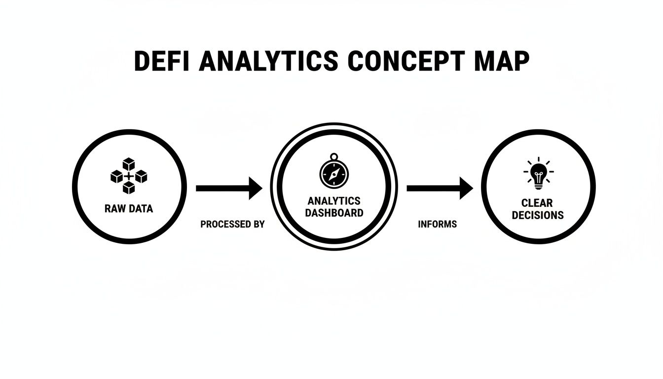
DeFi dashboard analytics are your secret weapon for turning the chaotic noise of blockchain data into a clear, actionable map. Think of them as the ultimate navigation system for the wild world of Decentralized Finance (DeFi), helping you find the safest and most profitable routes for your stablecoin yield strategies. This kind of clarity is absolutely essential for making confident, data-driven decisions.
Your Compass for Navigating DeFi Yield Opportunities
Imagine trying to sail across a vast ocean without a map or a compass. That’s pretty much what earning yield on stablecoins can feel like without the right tools.
You've got thousands of liquidity pools, lending protocols, and vaults scattered across dozens of blockchains. Each one has constantly shifting interest rates, risks, and opportunities. Trying to track all this manually isn't just a headache; it's nearly impossible and incredibly risky.
This is where DeFi dashboard analytics comes in to save the day. These platforms suck in a sea of raw blockchain data—transactions, liquidity levels, borrowing demand—and boil it all down into a single, coherent view. Instead of a chaotic mess, you get an organized map that shows you where to go and warns you about treacherous waters.
Why Analytics Are Non-Negotiable
Without a solid analytics dashboard, you’re basically flying blind. You might jump on a juicy Annual Percentage Yield (APY) without realizing the protocol's security is shaky or its liquidity is draining faster than a leaky bucket. A dashboard gives you the context to understand the "why" behind the numbers, turning you from a passive gambler into an informed strategist.
This is exactly why so many seasoned investors check out guides on how to earn interest on stablecoins before putting their capital to work.
The importance of this clarity is huge. In fact, data and analytics have quietly become one of the most critical segments in the entire ecosystem.
Industry research shows the data and analytics segment is the dominant application in DeFi, even ahead of lending or payments. With the overall DeFi market projected to exceed $1.4 trillion by 2033, this highlights a simple truth: capital flows to those with the clearest and fastest insights into risk-adjusted returns. You can learn more about the research behind these DeFi market forecasts.
From Raw Data to Confident Decisions
A well-designed dashboard doesn't just throw numbers at you; it tells a story about a protocol's health and sustainability. This is the real magic—turning raw data into something you can actually use. It empowers you to:
Compare Opportunities: Quickly size up multiple yield-bearing protocols side-by-side using the same set of metrics.
Assess Risk: Spot potential red flags, like sudden drops in locked funds or unaudited smart contracts, before you invest a dime.
Monitor Performance: Keep an eye on your positions in real-time and understand how the market is impacting your earnings.
At the end of the day, using DeFi dashboard analytics is all about replacing guesswork with strategy. It gives you the visibility you need to manage risk effectively and make smarter decisions about where to put your money in this ever-changing space.
Decoding the Dashboard: Key Metrics for Stablecoin Strategies
Stepping into a DeFi dashboard for the first time can feel like trying to read a foreign language. All the charts, percentages, and weird acronyms might seem a bit much, but trust me, each little metric is telling you a crucial part of a protocol's story. Learning this language is what separates a lucky guess from a smart, calculated investment.
Think of a dashboard as your translator. It takes all the raw, chaotic data happening on the blockchain and turns it into a simple narrative you can actually understand and use.
Let's break down the most important metrics you'll bump into and what they really mean for your stablecoin strategy.
Differentiating APY from APR
The first two metrics you’ll see plastered everywhere are Annual Percentage Rate (APR) and Annual Percentage Yield (APY). People often throw these terms around interchangeably, but the difference between them is massive for figuring out your actual returns.
APR is basically simple interest. It’s the return you’d earn in a year if you didn't touch your earnings. For instance, a 10% APR on a $1,000 deposit gets you a straightforward $100 over one year. Simple.
APY, on the other hand, is where the magic of compounding comes in. It shows you the return you’d get if your profits were automatically reinvested to earn even more profits. That same 10% APR, when compounded daily, turns into a 10.52% APY. So instead of $100, you'd pocket $105.16. For any long-term stablecoin play, APY is the number you want to be watching.
Measuring Trust with Total Value Locked
Beyond the juicy returns, the next thing to check is Total Value Locked (TVL). This is just the total amount of money everyone has deposited into a protocol. Think of it as the protocol's "trust score" or its rank in a popularity contest.
A high and growing TVL is a great sign. It tells you that a lot of people trust the protocol with their money, which usually means it has solid security, good liquidity, and a decent track record. A TVL in the hundreds of millions or billions? That’s some serious community confidence.
A sudden, sharp drop in TVL can be a major red flag. Even if the APY is sky-high, if TVL is plummeting, it might mean users are spooked by a security issue or a change in rewards and are pulling their funds out. Fast.
On the flip side, a low or flat TVL could mean the protocol is brand new, unproven, or just not catching on. It might be an undiscovered gem, but it definitely comes with more risk.
Reading Demand with Utilization Rate
If you’re looking at lending protocols, the Utilization Rate is a vital sign of health. It’s just the percentage of all the deposited assets that are currently being borrowed. So, if a pool has $10 million in USDC and $7 million of it is borrowed, the utilization rate is 70%.
This metric is a direct signal of demand. A high utilization rate is good news because it means borrowers are hungry for loans, which pushes up the APY for lenders like you. But if it gets too high—say, above 90%—it can get risky. There might not be enough cash left in the pool for depositors to withdraw if they need to.
Low Utilization (<40%): Weak demand from borrowers. This usually means lower APYs for you.
Healthy Utilization (50-85%): A sweet spot. Shows a balanced market with strong demand, leading to sustainable yields.
High Utilization (>90%): A bit of a warning sign. It could lead to a liquidity crunch where you can't get your funds out.
When you look at these metrics together, you get a much clearer picture. Effective real-time yield monitoring isn’t just about chasing the highest APY; it's about checking the TVL and utilization trends that are propping that yield up.
Assessing Safety with Risk Metrics
Finally, you can't wrap up a dashboard review without looking at the risk metrics. These are your first line of defense. Key things to look for include:
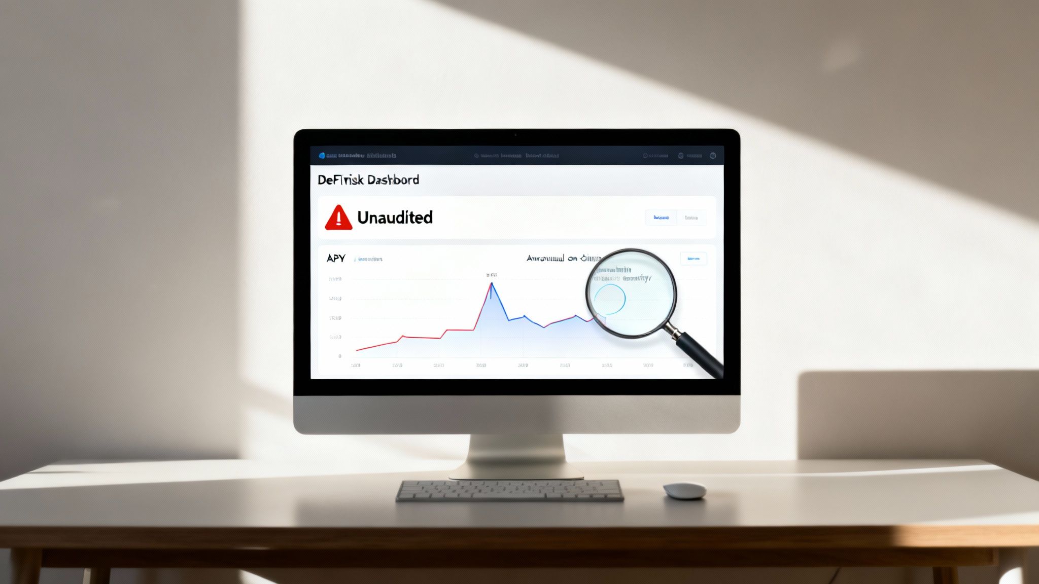
Smart Contract Audits: Has a reputable security firm audited the protocol's code? Look for a checkmark or a link to the audit report. An unaudited protocol is a serious gamble.
Protocol Age and Uptime: How long has this thing been running without getting hacked or having a major issue? A longer, cleaner track record generally means it's more secure.
Insurance or Bug Bounties: Does the protocol offer insurance or have a program that pays hackers to find bugs? These things show they're serious about protecting user funds.
Once you get the hang of reading these key metrics, you go from being a passive participant to an active strategist. You can glance at any dashboard and instantly get the story behind a protocol's health, sustainability, and safety.
Turning Data Into Confident Decisions
Data on its own is just noise. It's how you interpret that data that gives you an edge. Think of a DeFi analytics dashboard as your translator, turning a mess of raw numbers into profitable, risk-aware decisions for your stablecoin strategy. It’s all about learning to read the story the numbers are telling.
Let's walk through a couple of real-world situations to see how this plays out. Getting a feel for these patterns is what separates a genuine opportunity from a dangerous trap.
Scenario 1 The Classic Yield Trap
You're scrolling and you spot it: a protocol offering a mouth-watering 35% APY on USDC. Super tempting, right?
But before you dive in, you glance at the other key metrics on your dashboard. You notice its Total Value Locked (TVL) has cratered, dropping 20% in just the last week. This is the textbook definition of a yield trap. The APY is spiking because as people pull their money out (sinking the TVL), the rewards get split among fewer and fewer participants. It's a mirage.
What you see: A sky-high APY next to a rapidly falling TVL.
What it means: The market is losing confidence, and capital is fleeing. That juicy yield isn't a sign of health; it's a symptom of a potential collapse.
Your Action: Hard pass. The risk of the protocol imploding or the yield evaporating overnight is just too high.
This simple act of cross-referencing metrics is the core job of a good dashboard. Without the TVL context, that APY looks like a golden ticket. With it, you see the massive red flag waving right in your face.
Scenario 2 Spotting a Healthy Protocol
Now, let's flip the script. You find a different protocol with a steady, respectable 8% APY. It’s not going to make you rich overnight, but you decide to dig a little deeper.
On the dashboard, you see its TVL has been slowly but consistently climbing for the last three months. No sudden spikes, just steady growth. You also check its utilization rate, which is holding strong around 75%. This tells you there's real, sustained demand from borrowers willing to pay that 8% to people like you. The yield isn't being artificially propped up by inflationary token rewards.
By combining these data points—a modest but stable APY, consistent TVL growth, and a healthy utilization rate—you can form a much more confident thesis. This isn’t a get-rich-quick scheme; it's a signal of a sustainable, trustworthy protocol worth exploring further.
Using Historical Charts to Your Advantage
Modern dashboards don't just show you today's numbers; they give you the full story with historical charts. Looking at these graphs is like reading a protocol's financial history book.
Historical APY Chart: You're looking for stability here. A yield that swings wildly from 5% to 50% every week is completely unreliable and likely propped up by short-term gimmicks. A yield that trends smoothly, on the other hand, points to a more mature and predictable ecosystem.
Historical TVL Graph: A healthy graph shows a steady upward climb or a stable plateau. Sharp, sudden drops are almost always a bad sign, often telegraphing bad news like a security scare or broken tokenomics before it hits the headlines.
By analyzing these trends, you shift from making reactive guesses to building a proactive strategy. You’re no longer just chasing the highest number on the screen; you’re investing in protocols that have demonstrated long-term health and stability.
This strategic value isn't just limited to DeFi; for a broader look at how dashboards serve as a lifeline in other industries, check out this complete guide to social media analytics dashboards. At the end of the day, it's about turning a complex sea of data into a clear "yes," "no," or "wait and see."
How to Spot Red Flags and Avoid Common Pitfalls
The DeFi world is brimming with incredible opportunities, but let’s be real—it's also a minefield of hidden dangers. Think of this section as your defensive playbook. We're going to show you how to use DeFi dashboard analytics to spot trouble long before it ever threatens your portfolio.
This isn't just about chasing yield; it's about protecting what you have. Getting good at recognizing the common red flags and pitfalls is what separates the winners from the horror stories.
The Siren Song of Unsustainable APYs
The oldest trap in the DeFi book is an outrageously high APY that seems too good to be true—because it almost always is. These yields are often propped up by little more than inflationary token rewards. The protocol simply prints its own native token to pay out rewards to users.
Imagine a company paying its employees by printing endless shares of its own stock. It’s not a sustainable model.
This kicks off a vicious cycle. The crazy APY pulls in new users, who start receiving these freshly printed tokens. What do they do? They usually sell them immediately, which crashes the token's price. That 100% APY looks great on paper, but if the reward token's value plummets by 95%, you've actually lost money.
Your dashboard is your first line of defense here. Look for a breakdown of where the yield is coming from. Is it from genuine borrowing demand and trading fees, or is it mostly labeled "rewards"? If it’s the latter, you need to be extremely careful.
“Code Is Law”… Until It Breaks: Unaudited Smart Contracts
In DeFi, your money isn't sitting in a bank vault. It's locked in a smart contract, which is just a piece of code running on the blockchain. If that code has a bug or a vulnerability, hackers can exploit it and drain every last dollar. This is why a professional security audit is the absolute bare minimum for any protocol you even think about using.
A good analytics dashboard should make this information impossible to miss.
Look for a clear "Audited" badge, often right next to the protocol’s name. Reputable dashboards go out of their way to highlight this.
Check the audit firm. Not all audits are created equal. Audits from well-known security firms like CertiK, Trail of Bits, or OpenZeppelin carry a lot more weight.
No audit information? Consider this a massive, flashing red flag. It’s the crypto equivalent of parking your car in a sketchy neighborhood with the keys still in the ignition.
Putting your funds into an unaudited protocol is a blind gamble on the developers' perfection—a bet that has cost users billions over the years. Don't make it.
Reading the Tea Leaves: On-Chain Activity and TVL Drains
Sudden, unusual on-chain activity can be the canary in the coal mine. A sharp, unexpected drop in a protocol's Total Value Locked (TVL) is one of the most urgent warnings your dashboard can give you.
Picture a protocol’s TVL chart. If it suddenly looks like a cliff, that's a bad sign. It means users are pulling their money out en masse, which is a massive vote of no confidence. It could be triggered by a rumored hack, a sudden change in rewards, or even insiders getting out before bad news hits the public.
A healthy protocol shows steady, organic TVL growth or at least stability. A TVL chart that's all over the place, especially with sharp, unexplained drops, screams instability and high risk. Don't let a juicy APY blind you to the fact that everyone else is running for the exit.
Another thing to watch out for is a high concentration of funds in just a few wallets. Some dashboards show holder distribution. If you see that a small number of "whale" wallets control most of the protocol's liquidity, they could pull their funds at any moment and cause the entire system to collapse.
By using your dashboard to look past the surface-level APY, you start to develop a defensive mindset. Scrutinizing the yield source, verifying audits, and monitoring the flow of capital—these are the skills that turn regular DeFi users into savvy investors.
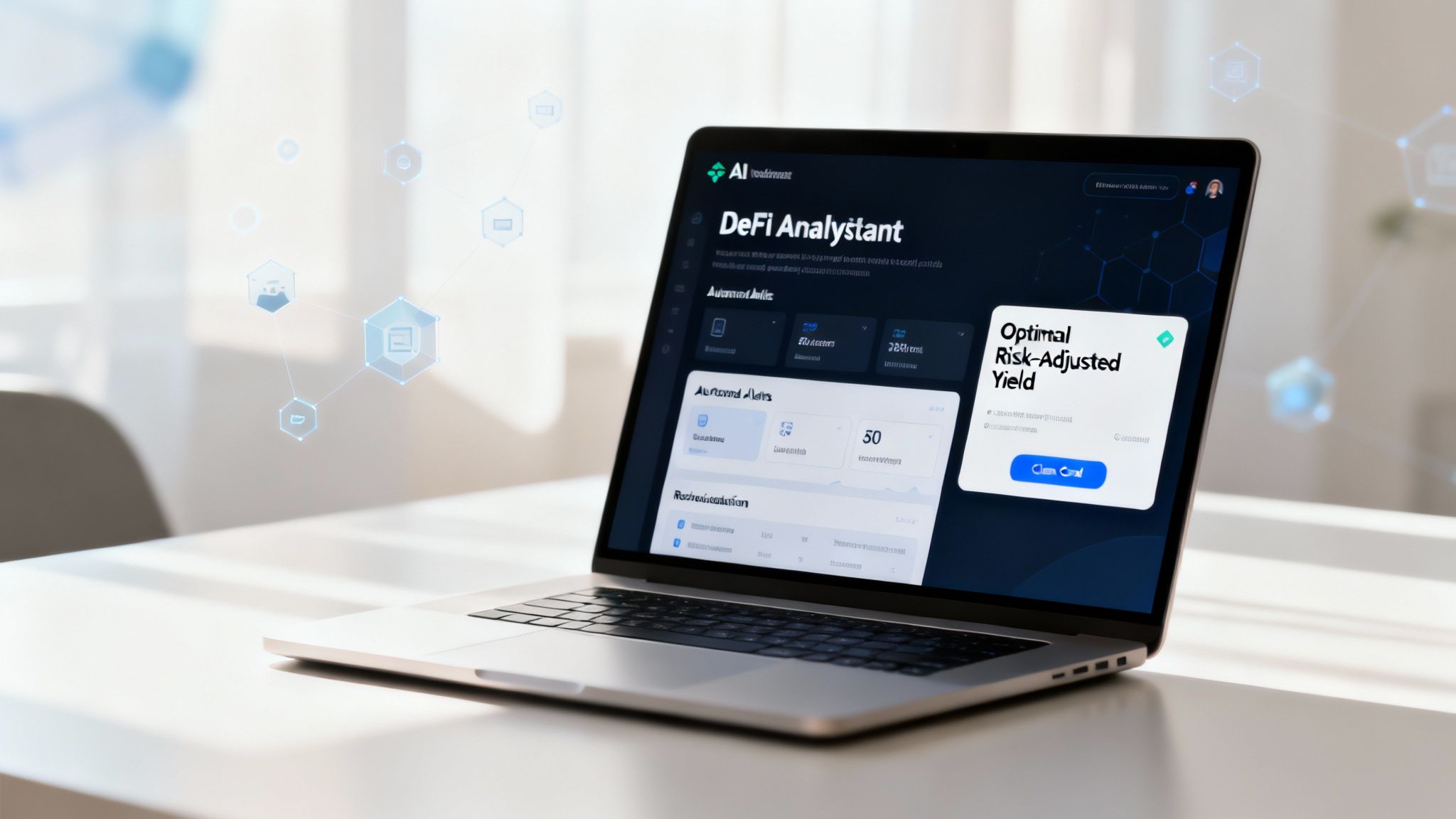
The AI Advantage in Modern DeFi Analytics
Let's be honest: manually keeping tabs on multiple DeFi dashboards isn't just a hassle; it's a full-time job. With thousands of protocols scattered across dozens of blockchains, the amount of data is just too much for any one person to track well.
This is where the next leap in DeFi dashboard analytics comes in, powered by artificial intelligence.
Think of an AI-driven platform not as another chart to stare at, but as your own dedicated team of expert analysts working around the clock. It's constantly sifting through thousands of data points—from tiny yield shifts and liquidity changes to subtle smart contract risks—all in real-time. Instead of you reacting to the market, an AI agent finds opportunities and flags threats faster than any human possibly could.
Automation Beyond Human Scale
The real magic of AI is its ability to process a staggering amount of information at incredible speed. A human investor might be able to keep up with a dozen protocols, maybe. An AI, on the other hand, can analyze every single relevant pool on every major chain simultaneously. This means it can spot and act on those blink-and-you'll-miss-it opportunities that most of us never even see.
This move toward instant, automated analysis is part of a much bigger picture. Global spending on big data and analytics is expected to climb to $420 billion by 2026, all driven by the need for live insights. Crypto markets are at the bleeding edge of this, treating blockchains like non-stop data firehoses.
For stablecoin investors, this is huge. Yields and risks can flip in a matter of minutes, especially when the market gets choppy. Platforms that can react instantly have a massive advantage.
Of course, any AI is only as good as the data it’s fed. The whole system relies on pulling in vast, high-quality information from across the DeFi space. The process of scraping data for AI models is the foundation that allows these agents to make sense of a chaotic environment and find the signal in the noise.
Key Benefits of AI-Powered Analytics
Bringing AI into your DeFi strategy offers three game-changing benefits, turning a complicated research grind into something that feels almost effortless.
Saves Time and Mental Energy: The AI handles the endless monitoring, so you don't have to. It boils down complex data into simple, actionable insights, letting you make good decisions without getting bogged down in the details.
Takes Emotion Out of the Equation: Fear and greed are the twin enemies of smart investing. An AI runs purely on data and the risk rules you set for it, executing strategies without bias or panic. It sidesteps common traps like chasing crazy-high yields or selling at the absolute bottom.
Capitalizes on Speed: In DeFi, being fast is a huge edge. An AI can spot a change in a protocol's health and move capital in seconds—a process that might take a human hours of research and button-clicking. This lets it grab the best yields and dodge risks before they become common knowledge.
By automating all the heavy analytical work, AI platforms like Yield Seeker level the playing field. They give regular investors access to the kind of sophisticated, data-driven strategies that were once only available to big financial firms with teams of quants.
Ultimately, this technology is changing how we interact with DeFi entirely. Instead of just showing you data, an AI yield aggregator acts on it. You can check out our guide to see exactly how an AI yield aggregator works to find and manage these opportunities.
This shifts your role from being a passive observer to a strategic manager. You set the rules, and the AI handles the complex execution. It’s the future of earning smarter, not harder, in decentralized finance.
Got Questions About DeFi Dashboard Analytics?
As you start digging into stablecoin yield strategies, you're bound to have questions. Getting good at reading DeFi dashboard analytics is a skill, and like any other, it gets better with practice. This section cuts right to the chase, tackling the most common questions investors ask so you can act with confidence.
Let's clear up the confusion and give you the practical insights you need to make sense of DeFi dashboards.
What’s the Most Important Metric for Stablecoin Yield?
While that flashy APY number is what grabs everyone's attention, the single most critical metric for managing your risk is arguably Total Value Locked (TVL).
Think of TVL as a protocol's trust score. It shows you how much money other users have collectively deposited, which is a powerful signal of their confidence in its security and long-term viability. A high and stable TVL—or even better, one that's growing steadily—suggests the protocol is trusted and has plenty of liquidity to handle withdrawals.
On the flip side, a sudden, sharp drop in TVL is a massive red flag, even if the APY is shooting for the moon. It often means the smart money is heading for the exits, maybe because of a security scare or wonky tokenomics. A huge APY is worthless if the protocol it's built on is about to implode. Always weigh the promised return against the trust demonstrated by the TVL.
How Can I Tell If a High APY Is Sustainable?
A high APY can be a golden opportunity or a cleverly disguised trap. The trick is to use your DeFi dashboard to figure out where the yield is actually coming from. A healthy, sustainable yield is generated from real economic activity.
Here’s what to look for:
Borrowing Demand: In lending protocols, a high utilization rate is a great sign. It means lots of people are actively borrowing the assets you're supplying and are willing to pay interest for them. That's a real, sustainable source of yield.
Trading Fees: For liquidity pools, check the daily trading volume. High volume means the pool is racking up significant fee revenue, which gets paid out to liquidity providers like you.
Inflationary Rewards: This is the one to watch out for. If a big chunk of the APY is labeled "rewards," it often means the protocol is just printing its own native token to pay you. Unless there's a very strong reason for people to buy and hold that token, its value is likely to tank over time, eating away at your real returns. A good dashboard will break this down for you.
A truly sustainable APY is backed by genuine user activity, not just by a protocol's money printer. If you can't easily see where the yield is coming from, be suspicious.
Are DeFi Dashboards Safe to Connect My Wallet To?
This is a critical question, and the answer isn't a simple yes or no. The vast majority of well-known DeFi dashboards are "read-only" tools. When you connect your wallet, you're usually just signing a message to prove you own the address. This lets the dashboard see your public, on-chain activity and display your portfolio—it never gets permission to touch your funds.
However, you have to stay sharp. Scammers are great at creating malicious websites that look exactly like popular dashboards. They'll try to trick you into signing a transaction that gives them permission to drain your wallet.
Stick to these simple safety rules:
Use Well-Known Platforms Only: Stick to dashboards with a solid reputation and a long history in the community.
Verify the URL: Always, always double-check that you are on the correct website before connecting your wallet. Bookmark your trusted sites to avoid clicking on phishing links.
Never Sign a Spending Transaction: A read-only connection should never ask you to approve a transaction that spends your tokens or grants "unlimited approval." If you see a request like that on an analytics site, get out of there immediately. It's almost certainly a scam.
For just tracking your portfolio, a simple signature to prove you're the owner is all that should ever be needed.
Can I Rely on a Dashboard's Risk Score?
The risk scores you see on DeFi dashboards are fantastic as a first-pass filter, but you should never rely on them alone for your due diligence. These scores are usually created by algorithms that check off a list of specific criteria.
Common things that go into a risk score include:
Has the protocol's code been audited by a reputable firm?
How old is the protocol and has it ever been hacked?
What's the TVL and how has it been trending?
Are there centralization risks, like a small team holding keys that could control everything?
While this is all incredibly valuable information, it can't see every possible danger. A risk score won't tell you about a clever economic exploit that an audit missed, or the risk that the team might just walk away from the project.
So, use risk scores as a starting point to quickly filter out the obviously dangerous options. Once you have a shortlist of protocols that score well, it's time to do your own digging. Read the audit reports, get a feel for the protocol's mechanics, and decide if you're truly comfortable with the risks that remain. Think of the score as a helpful guide, not the final word.
Ready to move beyond manual tracking and put AI to work? Yield Seeker offers a smarter, automated way to earn yield on your stablecoins. Our AI agent monitors the market 24/7 to find the best risk-aware opportunities, so you don't have to. Start your journey toward effortless DeFi yield today.